|
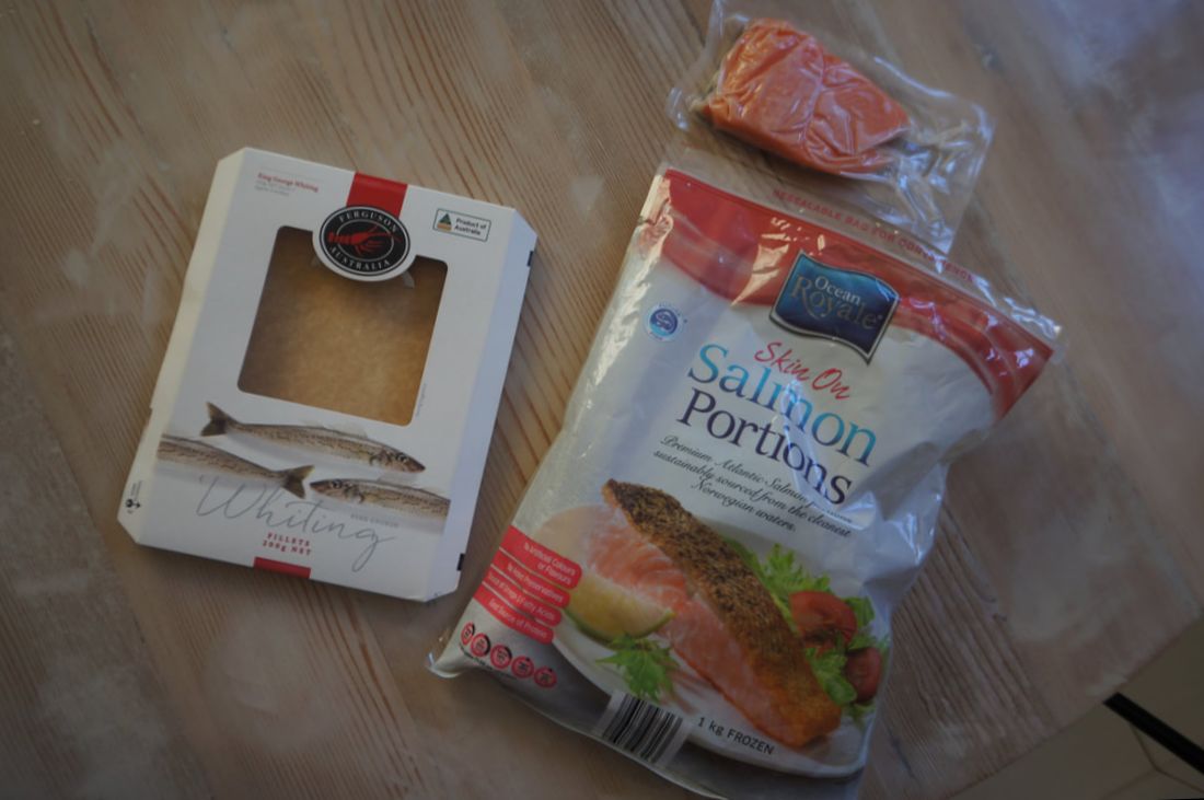
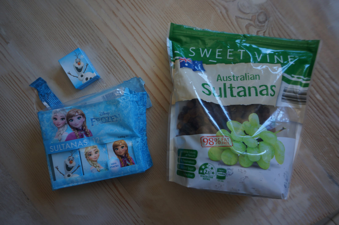
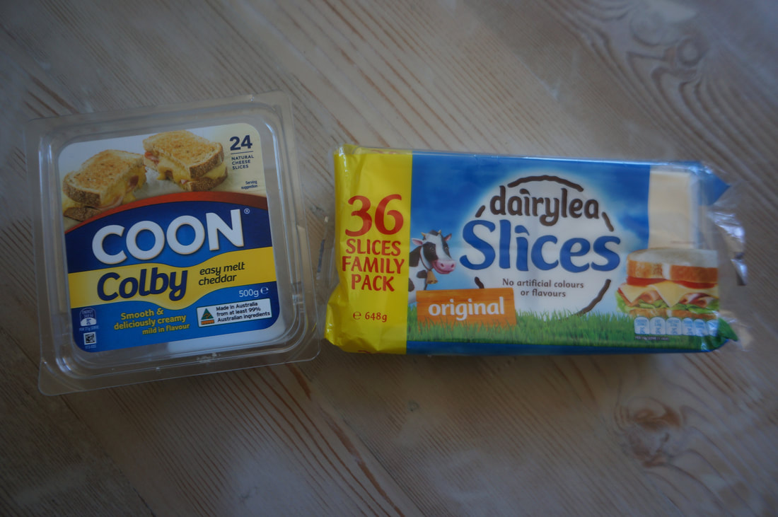
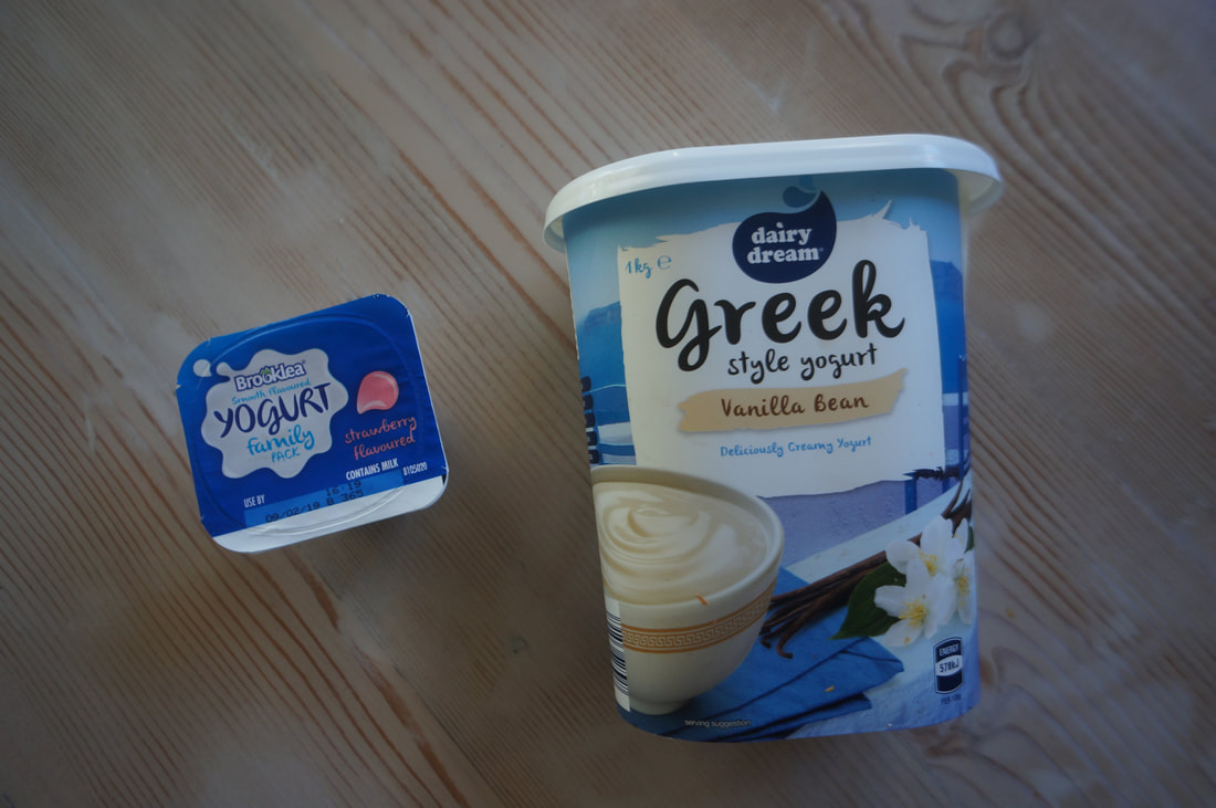
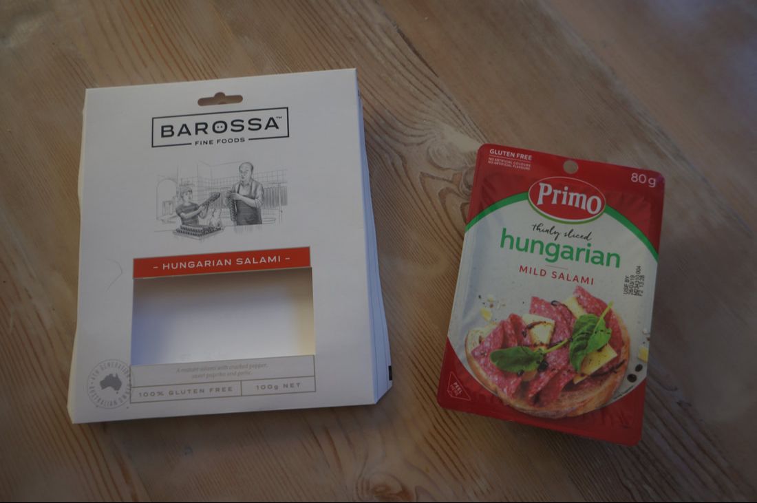
Here are two frozen fish packages. Both use a large section of negative white in the background and both use red as a dominant colour. The packaging of the Ocean Royale Salmon Portions make it easy to freeze and take out a serve easily as they are all individually vacuum packed. They are a good meal size and the package comes in a kilogram size.It's quite cost efficient. The Ferguson Whiting packaging has a window where you can actually see the meat which may be enticing to some consumers. The packaging is slick and gives a feel of a more premium product. These sultanas are marketed in two very different ways. One uses a more bulk buy concept while the other is mini packaged. The Australian sultanas focuses on the local content and is pretty straight forward, while the Frozen sultanas uses merchandising from a kids movie to entice kids to pester their parents to buy a product that uses more packaging than necessary and gives you less sultanas for dollar spent. But what can I say, they showed up in my pantry due to the insistence of my daughter! The Frozen sultanas give little indication of where they have come from or their health benifits, they simply are Frozen Sultanas and that's good enough. The Australian Sultanas have all of the necessary information, and have a zip lock back, which by the way is one of the greatest inventions along with the cable tie. What is interesting about these two cheese packages is the similarity in colours. Red, yellow, blue. Dairylea focuses on the size of the pack, with a big yellow band on the left side with large red writing "36 slices..". Coon is using their brand recognition, stamping their name in bold white writing in the middle of the packaging. The style of the dairylea cheese packaging is individually wrapped slices much like the Kraft Singles. Coon on the other hand use a solid square container that holds the sliced cheese and seals the cheese in once closed. It uses only a single wrapping of plastic for all of its slices, unlike dairylea's packaging. Here again are two different approaches to packaging marketed at two different sets of consumers. The Brooklea family pack comes with 12 small sized servings of individually packaged yoghurt, while the Greek Style Yoghurt is 1kg. Brooklea is focusing on the family who no doubt need to pack lunches. The Dairy Dream Greek Yoghurt comes in a very sturdy container, rounded at the edges. The shape of the cursive fonts used are also echoed in the wispiness of the background banners and in the Dairy Dream logo. Brooklea follows suit with a cursive font and tear drop shaped blobs. Two different salamis, the Primo has a very standard common style of packaging for this product, a plastic tray with a rip off seal, while Barossa Fine Foods have opted for a card packaging with a window. The use of a large area of negative white does make the product stand out from others as a lot of the other brands on the shelf do have cluttered imagery in comparison and the primo salami is an example of this. Barossa fine foods uses a small illustration to give the idea that this is a family business with a face that has run for decades, whereas Primo is simply a company with little story present on their packaging apart from the necessary writing and imagery.
For a bit of extra reading check out this interesting article on colours in food packaging : hartdesign.com/industry-news/food-packaging-color-influences-consumer-behavior/.
0 Comments
|
